| Validation Server Control |
| |
| An Example Using Validation Server Controls |
| |
| How to Add the Validation Server Controls in Web Page? |
| |
1. Open a web page in Design View.
2. Click on Toolbox tab to make it available to use.
3. Select the âValidation? item in the Toolbox.
4. On select âValidation? you will get the listing on Standard web server controls. |
| |
 |
| |
| 5. Select the validation control and keeping mouse button pressed drag it to the web page. |
| |
| In this example the used Validation Server controls are following: |
| |
Required Field Validator
Range Validator
Compare Validator
Validation Summary |
| |
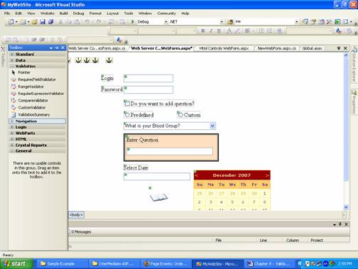
| After dropping all the validation server controls your web page in Design View will look like given in the figure below. |
| |
 |
| |
To set an image url or source, set it using âImageUrl? of Image Button control, you can write path of the url or source and also can browse the location using this  button as given in the âProperties Window?. button as given in the âProperties Window?. |
| |
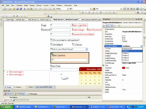
6. Select the control using mouse then click on âProperties Window? tab to modify the properties like ErrorMessage, ID, ForeColor etc.
7. Enter the text in front of Text property and press Enter key.
8. Select the âControlToValidate? property and choose the control for validation. |
| |
| Here the Error Message of the Required field validator is changed to âEnter Login Field? and âControlToValidate? property is set for âTextBox1?. |
| |
| Similarly you can change the other properties of the validation controls as given in the figure below. |
| |
 |
| |
| Note: You can use more than one validation controls for a validation. In example given above the Password use two validations which are following: |
| |
⢠Password must required value
⢠Password string length must be greater than equal to 2 and less than equal to 6. |
| |
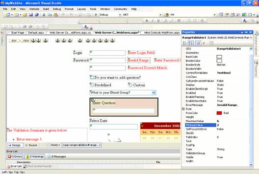
| To set the Range Validator you have to set the two properties which are MinimumValue and MaximumValue to decide the range (see in figure given below). |
| |
 |
| |
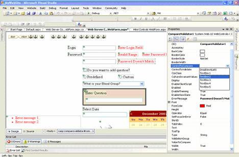
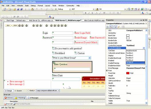
| To set the Compare Validator control you have to use two properties, ControlToCompare for control to compare the value with and ControlToValidate for validating the input value after comparison as given in figure below. |
| |
 |
| |
 |
| |
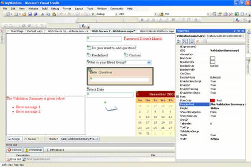
| You can set the âHeaderText? property of Validation Summary to display heading as in figure below. |
| |
 |
| |
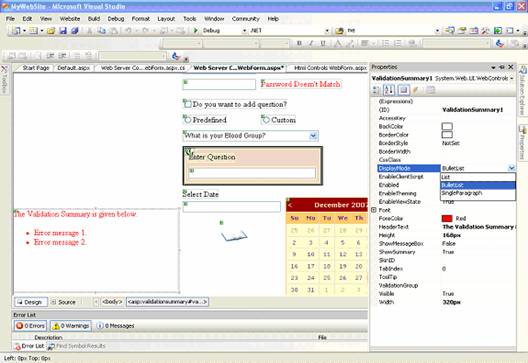
| You can set the display of the validation summary text using the DisplayMode property as given in the figure below. |
| |
 |
| |
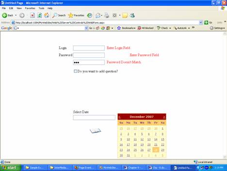
| Output of the Sample Program |
| |
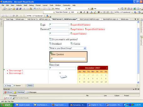
| Here the text written in red color is the Error Messages of validation controls. |
| |
| Error Messages are displayed if not fulfill the condition of the validations. |
| |
 |
| |
| The first two red colored error messages shows that use must enter some value in these two text boxes. |
| |
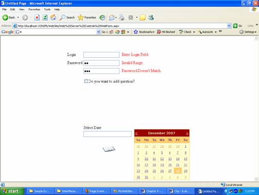
| Here password shows different error message due to invalid range of entered value as given in figure below. |
| |
 |
| |
| You can see in the figure given above that the entered password in two text boxes are not of similar length therefore validation control displayed an error message. |
| |
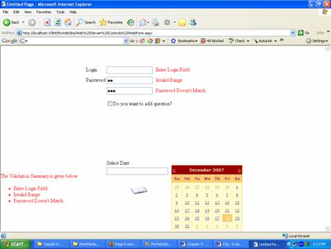
| Here in this figure you can see the Validation Summary of the error message which is shown in red colored text in left bottom corner of the web page. You will get the Validation Summary message after the click on button or post back of the web page. |
| |
 |
| |
|
| |