| ASP.Net Web Server Control |
| |
| An Example of Using ASP.NET Web Server Controls |
| |
| How to Add the Web Server Controls in Web Page? |
| |
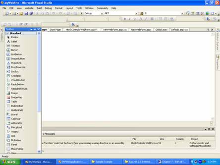
1. Open a web page in Design View.
2. Click on Toolbox tab to make it available to use.
3. Select the âStandard? item in the Toolbox.
4. On select âStandard? you will get the listing on Standard web server controls. |
| |
 |
| |
| 5. Select the control and keeping mouse button pressed drag it to the web page. |
| |
| In this example the used Web Server controls are following: |
| |
Label
Hyperlink
Checkbox
Radio button
Calendar
Dropdown List
Image Button
Button
Panel |
| |
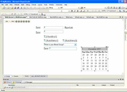
| After dropping all the web server controls your web page in Design View will look like given in the figure below. |
| |
 |
| |
6. Select the control using mouse then click on âProperties Window? tab to modify the properties like Text, ID, font size, font family etc.
7. Enter the text in front of Text property and press Enter key. |
| |
| Note: Here you can see the Image Button control (which contains a small image with âX? in red color). |
| |
To set an image url or source, set it using âImageUrl? of Image Button control, you can write path of the url or source and also can browse the location using this  button as given in the "Properties Window". button as given in the "Properties Window". |
| |
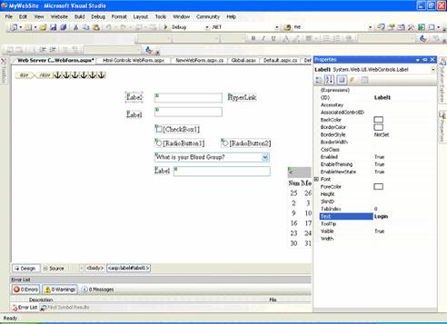
| In this figure the Text property of the âLabel? web server control is modified to âLogin? which was âLabel?. |
| |
 |
| |
| To modify the default properties of the web server control select the property in the Properties Window as given below. Similarly you can change the other properties of web server controls. |
| |
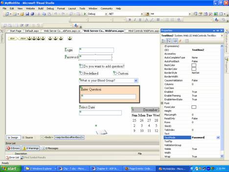
| After setting the Text property of the web server controls the web page in Design View will be displayed as given in the figure below. |
| |
 |
| |
| Here in the figure given above you can see a colored box. This server control is known as âPanel? and it is act as container for the controls. |
| |
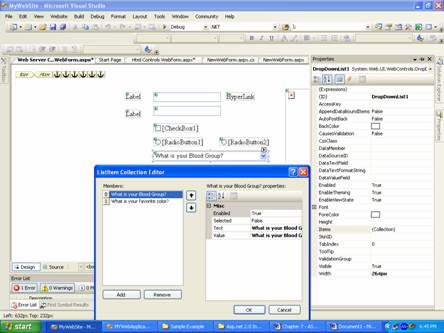
| How to add item in the Dropdown list web server control? |
| |
1. Select the Dropdown list control in Design View
2. Click on Properties tab
3. Select âItems? property in the Properties Window
4. Click on (Collections) and press button (see figure below) button (see figure below)
5. In ListItem Collection Editor, press âAdd? button to add item
6. Input the text property in front of âText? property and press Enter key
7. The visible property is set to false.
8. Press âOK? button |
| |
 |
| |
| Note: In this example controls whose visible property set to âFalse? are following |
| |
Dropdown list.
Radio Buttons and Labels near them.
Panel and controls inside it. |
| |
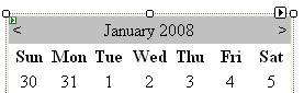
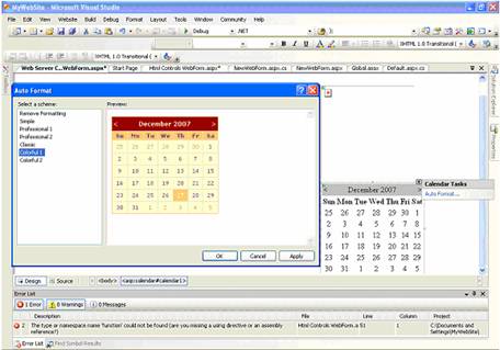
| How to set format of the Calendar web server control? |
| |
1. Select the calendar control in Design View(see figure below)
2. Use any of the two methods given below:
i. Right click and select âAutoFormatâ¦? from the Properties pop menu.
ii. Click on (smart tag) then select âAutoFormatâ¦? from Calendar Tasks |
| |
 |
| |
3. Select the Formats given in the AutoFormat Click on (Collections) and press button (see figure below)
4. Press âOK? button to apply the format. |
| |
 |
| |
| How to write the program code in the controlâs event? |
| |
1. Select the Web server control in Design View, say Checkbox
2. Double Click it, then you will find a Code View with like |
| |
protected void CheckBox1_CheckedChanged(object sender, EventArgs e)
{
} |
| |
3. Write the code as given in sample code.
Note: Take care of control ID names to process correct events Sample Code for Sever Control Events |
| |
using System;
using System.Data;
using System.Configuration;
using System.Collections;
using System.Web;
using System.Web.Security;
using System.Web.UI;
using System.Web.UI.WebControls;
using System.Web.UI.WebControls.WebParts;
using System.Web.UI.HtmlControls;
public partial class Web_Server_Controls_WebForm : System.Web.UI.Page
{
protected void Page_Load(object sender, EventArgs e)
{
}
protected void CheckBox1_CheckedChanged(object sender, EventArgs e)
{
if (CheckBox1.Checked)
{
RadioButton1.Visible = true;
RadioButton2.Visible = true;
}
if (!CheckBox1.Checked)
{
RadioButton1.Visible = false;
RadioButton2.Visible = false;
}
}
protected void RadioButton1_CheckedChanged(object sender, EventArgs e)
{
if (RadioButton1.Checked)
{
DropDownList1.Visible = true;
Panel1.Visible = false;
Label3.Visible = false;
TextBox3.Visible = false;
}
}
protected void RadioButton2_CheckedChanged(object sender, EventArgs e)
{
if (RadioButton2.Checked)
{
Panel1.Visible = true;
Label3.Visible = true;
TextBox3.Visible = true;
DropDownList1.Visible = false;
}
}
protected void Calendar1_SelectionChanged(object sender, EventArgs e)
{
TextBox4.Text = Calendar1.TodaysDate.ToShortDateString();
}
} |
| |
| Output of the Sample Code |
| |
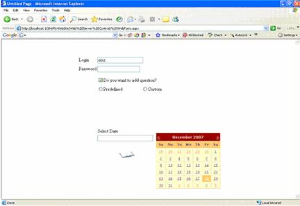
| Some controls are not available as their âvisible? property is set to false. |
| |
 |
| |
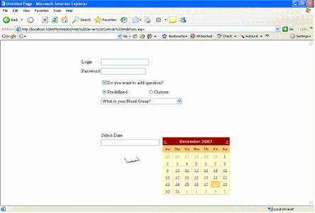
| Now click on the Check box then you will see Radio button controls as given in the figure below |
| |
 |
| |
| On selecting Predefined Radio button the Dropdown list will be visible. |
| |
 |
| |
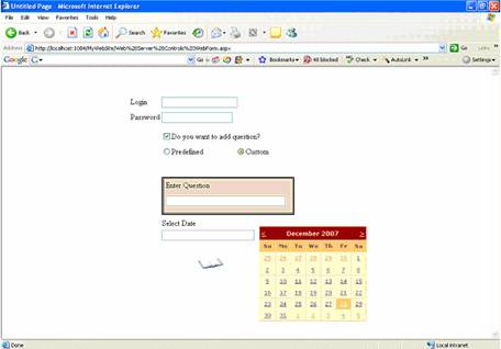
| On selecting Custom Radio button the Panel and its Controls list will be visible. |
| |
 |
| |
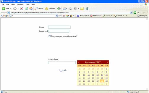
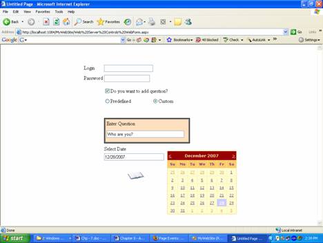
| On selecting date from the Calendar Control, the selected date will be visible in the Text box control below âSelect Date? Label control. |
| |
 |
| |
|
| |